The Team
Christian Mtima: Product Designer
Michael O: Graduate Product Designer
Emma W: Product Manager
Kofi D: Front-End Developer
Challenge
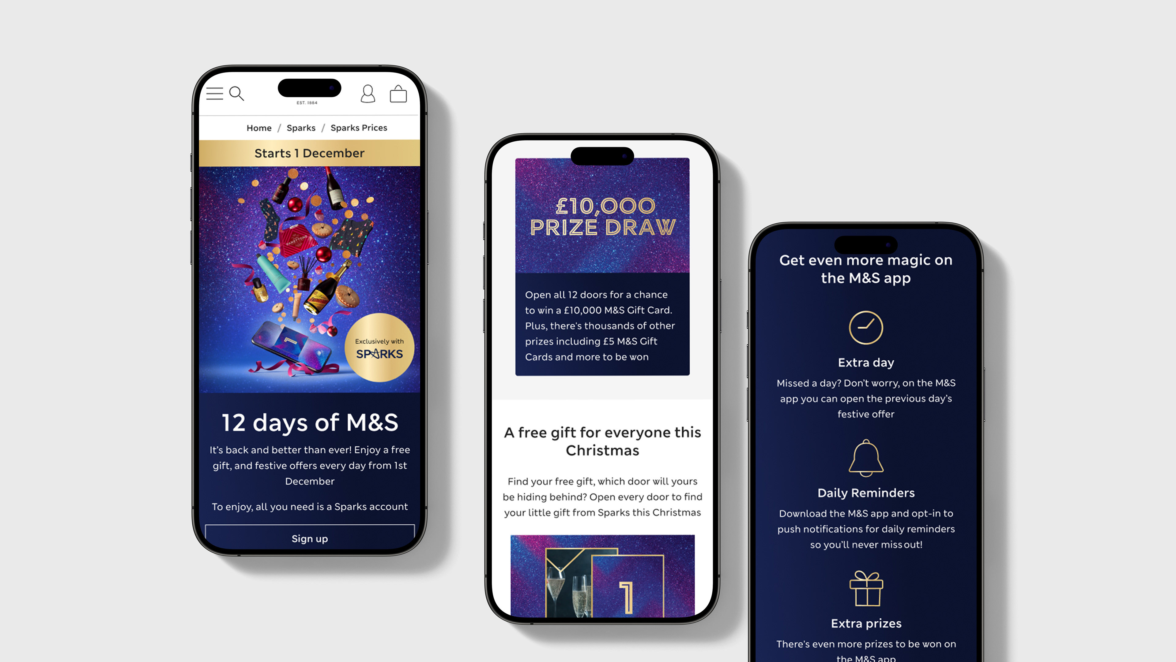
Refreshed Sparks Days Out pages for UK and ROI, aligning with new creative and Onyx migration.
Solution
Simplified pages with a step-by-step approach: "SPEND, REGISTER, ENJOY." Improved user experience for new and existing customers, added legal links and facilitated revisits. Emphasised inclusivity for all ages, not just kids and families.
Results
Integrated new branding, streamlined pages with clear steps, enhanced CTA visibility, and improved overall user-friendliness. Signposted legal information, created an easy revisitation feature, and highlighted Sparks Days Out's inclusivity. Revitalised the experience, aligning it with the desired user journey.
User flows
User testing insights
After discussions with marketing and the rest of the UX team, concerns arose about customer understanding of Sparks Days Out. We conducted user testing to gather insights, and the majority comprehended the product and how to access it. A small percentage faced confusion with signing up for the M&S Sparks account, leading to clear copy adjustments.
Old page vs new page
The new design on the right aims to reduce cognitive load and enhance page structure using our design system, streamlining the FAQs to avoid overwhelming users. By presenting "How it works" in three simple steps, we aimed to make accessing Sparks Days Out more user-friendly. Testing, particularly on the "How it works" section, yielded positive results with minor copy adjustments made for clarity.
Live page


