
The Team
Christian Mtima: Product Designer
Sonia: Product Manager
Dan: Product Manager
Challenge
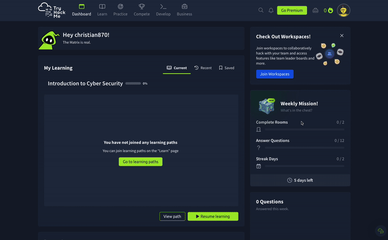
TryHackMe’s B2B Management Dashboard is underused by admin users from universities, colleges, and cybersecurity companies. Despite its potential to help teams manage user engagement and renewals, the dashboard currently offers low practical value. Users report blank states, a lack of actionable insights, and difficulty justifying renewal decisions due to insufficient data visibility.
Solution
Redesign the dashboard to surface clear, actionable insights that help admins manage user engagement and justify renewals. The MVP will prioritise key metrics, visualisations, and user needs uncovered through discovery. A simplified, insight-driven interface will replace blank states and low-value content, making the dashboard a core tool for admin users.
Results
Success will be measured by increased dashboard usage, improved admin confidence in renewal decisions, and positive usability feedback. A key outcome is a measurable uplift in subscription renewals from admins who find the redesigned dashboard valuable. The MVP will be ready for build by end of Q3.
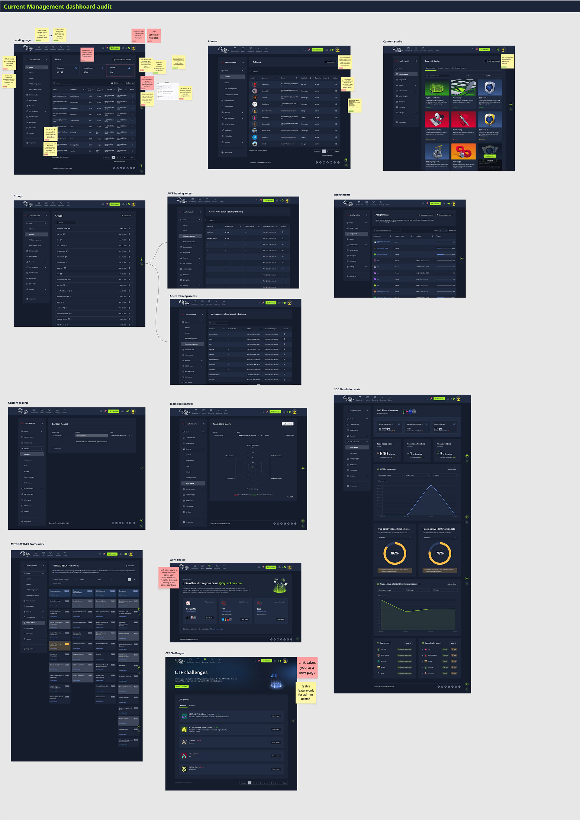
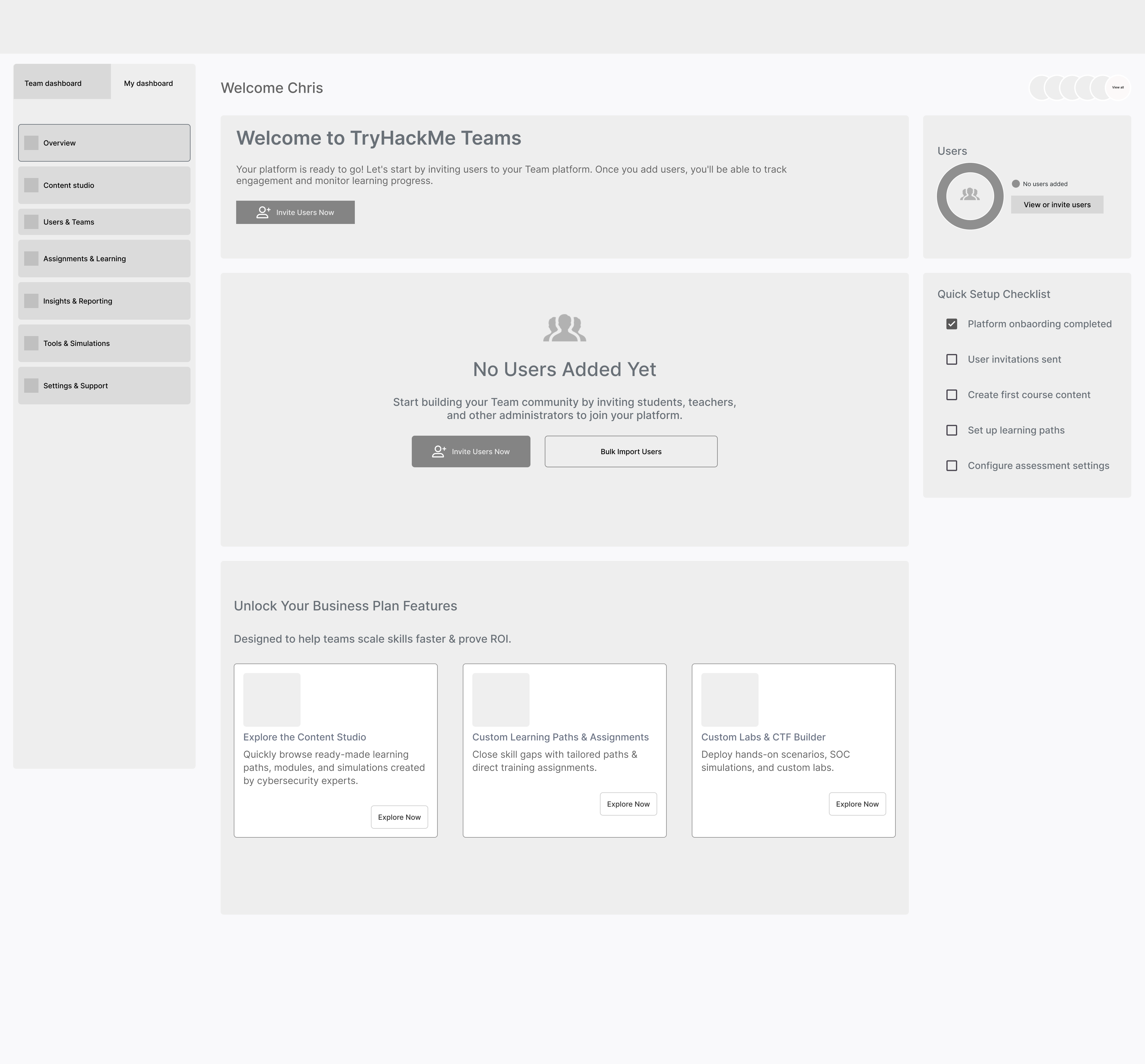
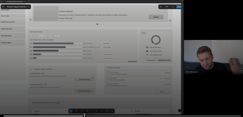
Current Dashboard
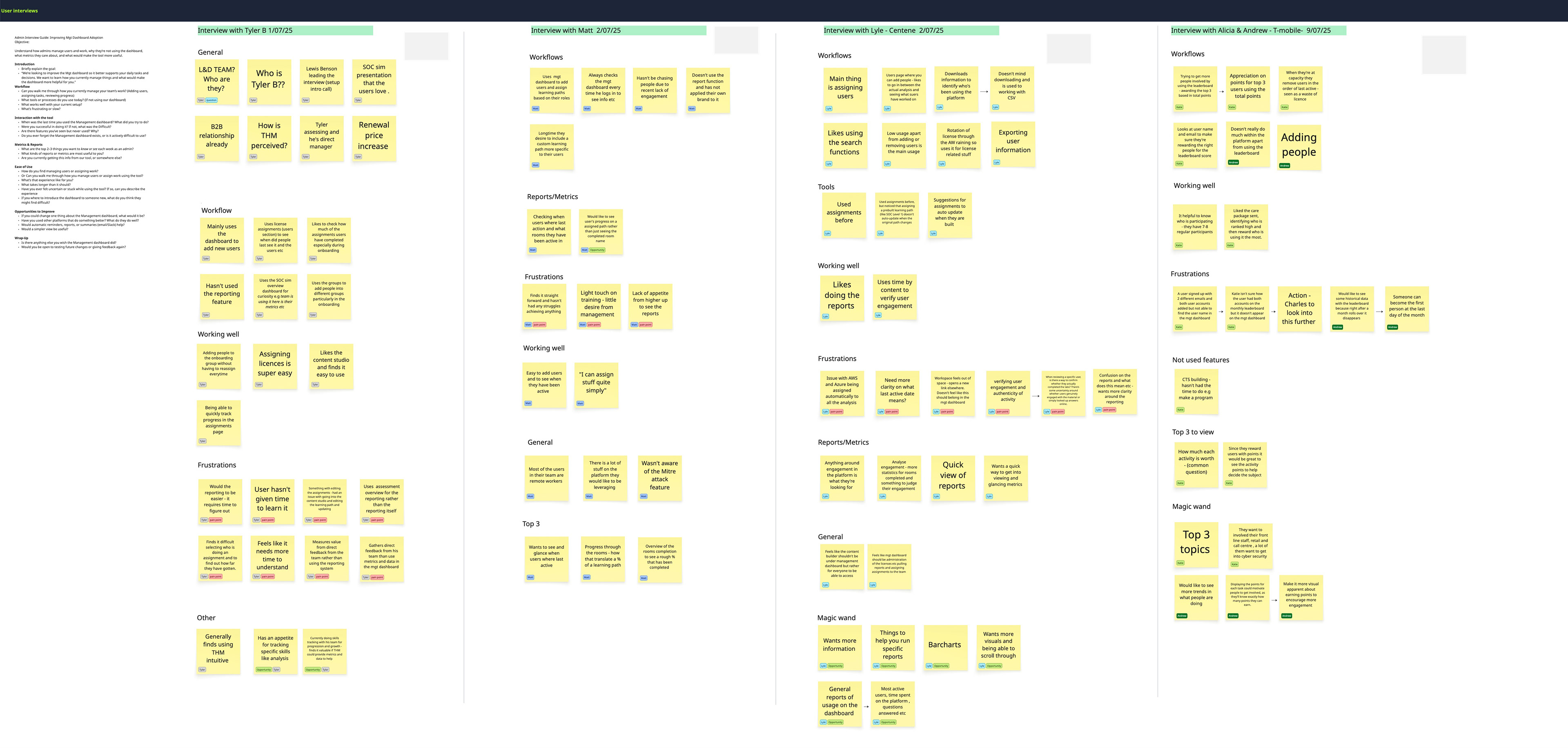
Admin User Interviews
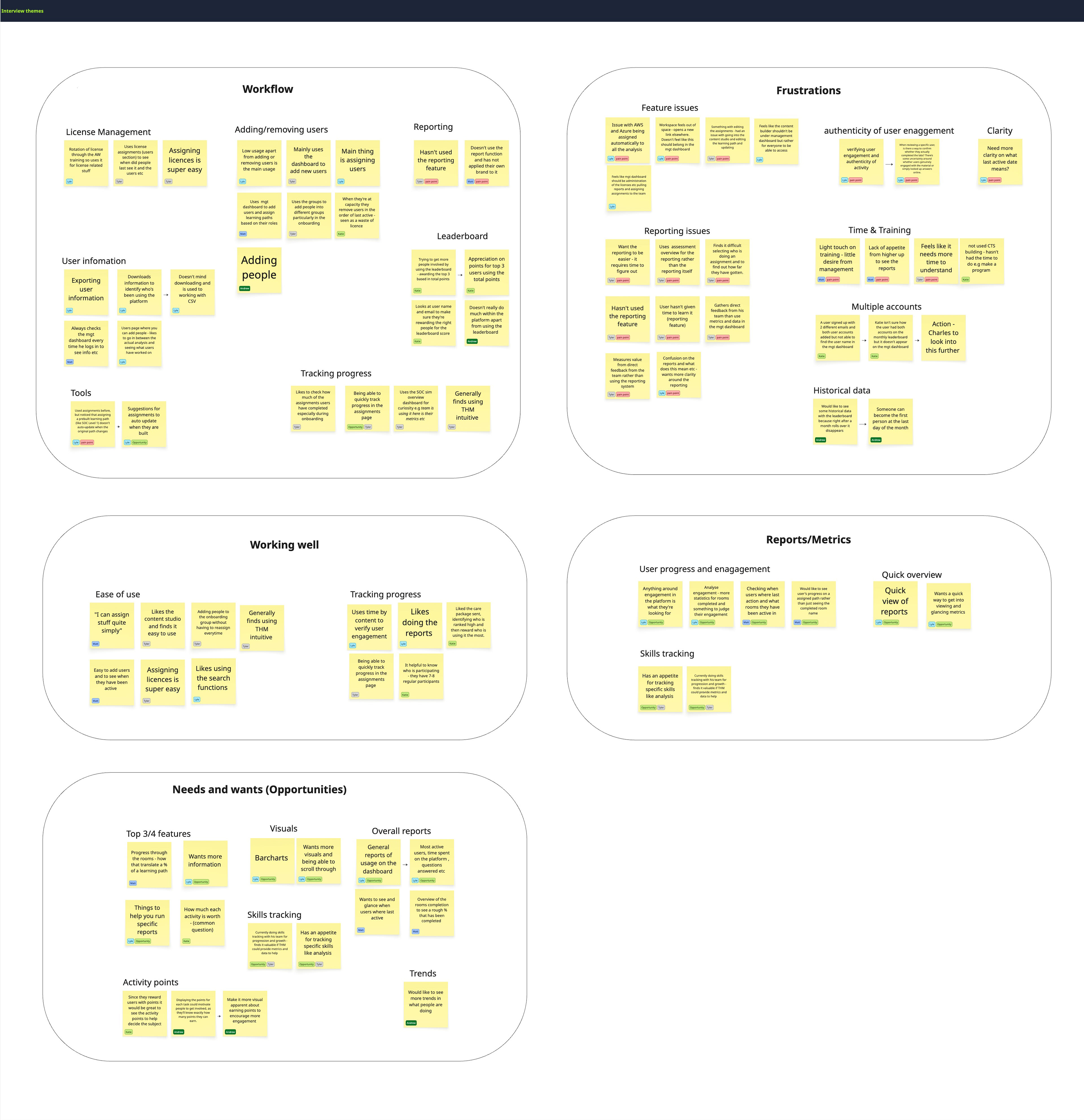
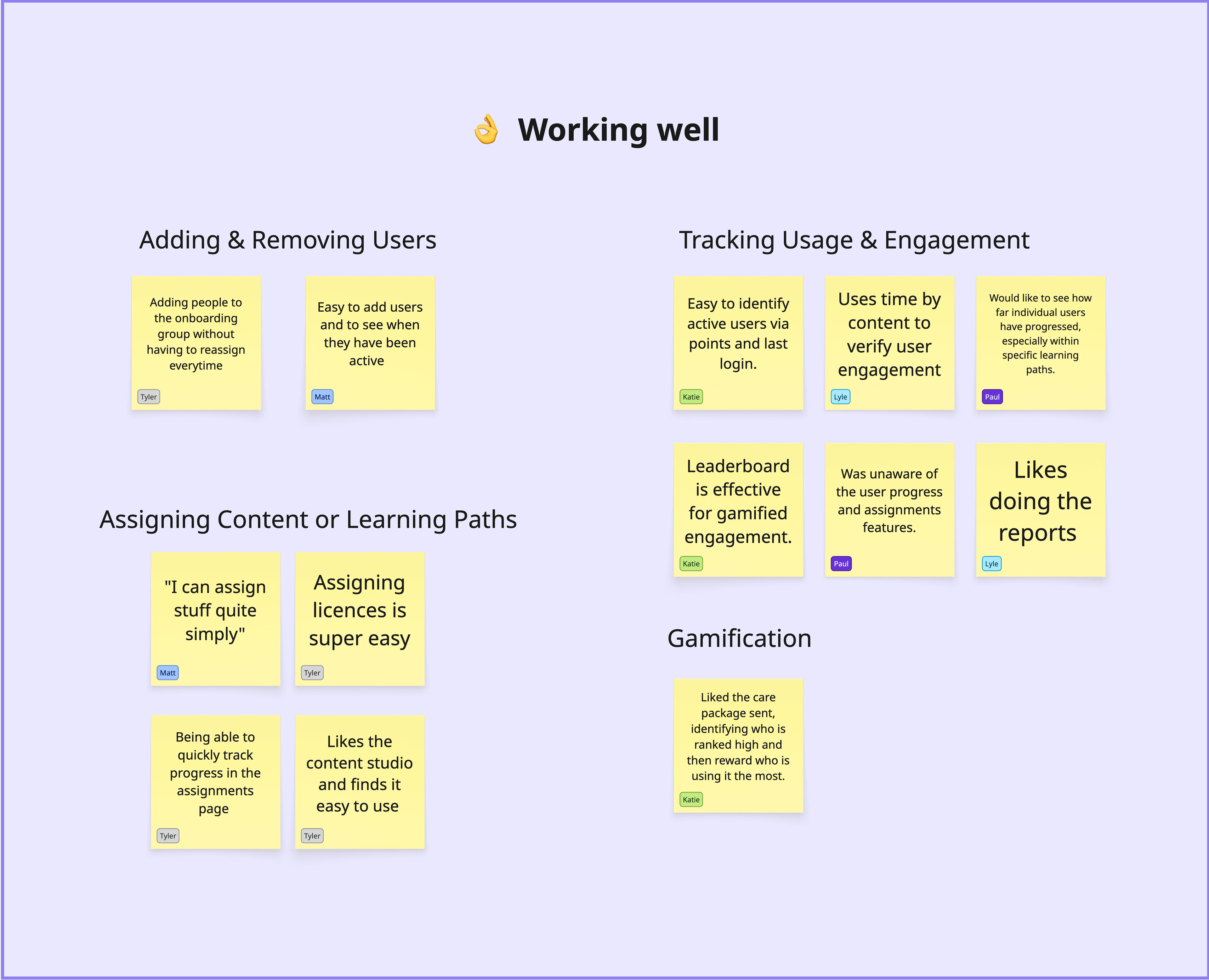
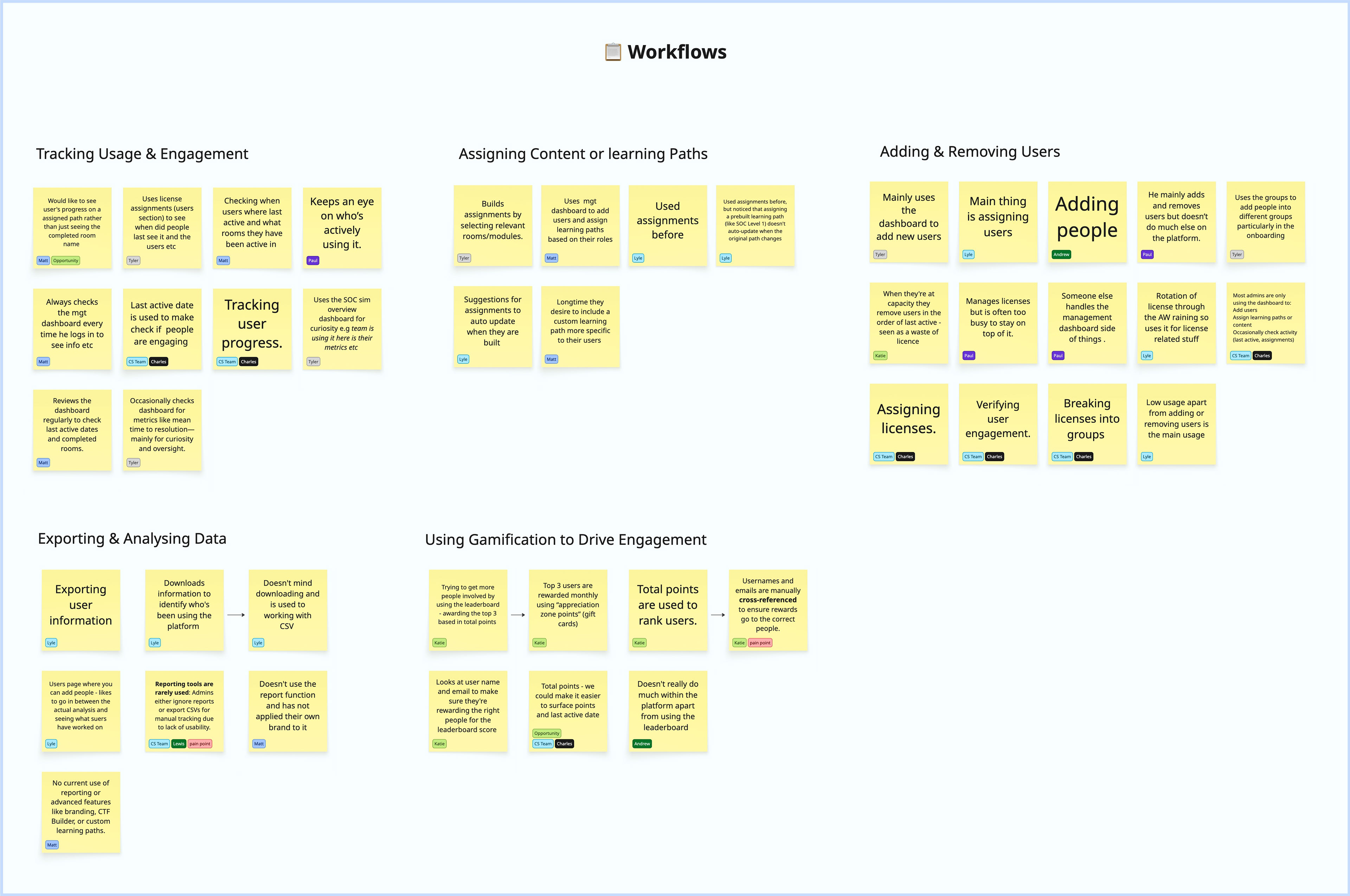
To better understand how admin users interact with the current Management Dashboard, we conducted a series of interviews with a diverse group of B2B clients. These sessions focused on uncovering key pain points, usability challenges, and unmet expectations. We explored what admins wish a management dashboard could offer, what insights would provide value, and what might drive more regular engagement.
The insights gathered from these interviews were instrumental in identifying common themes and feature opportunities—laying the foundation for a more purposeful and valuable dashboard experience.
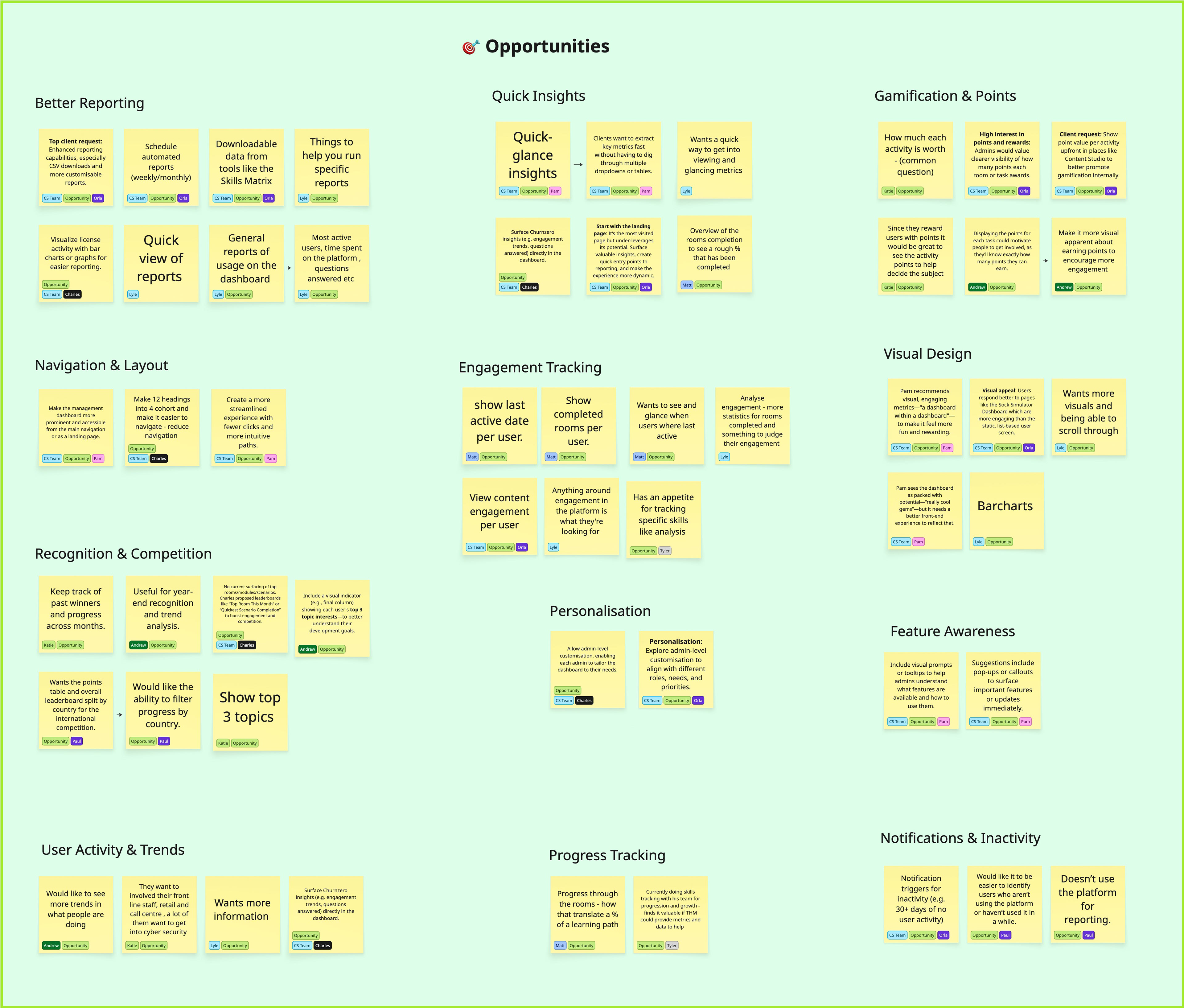
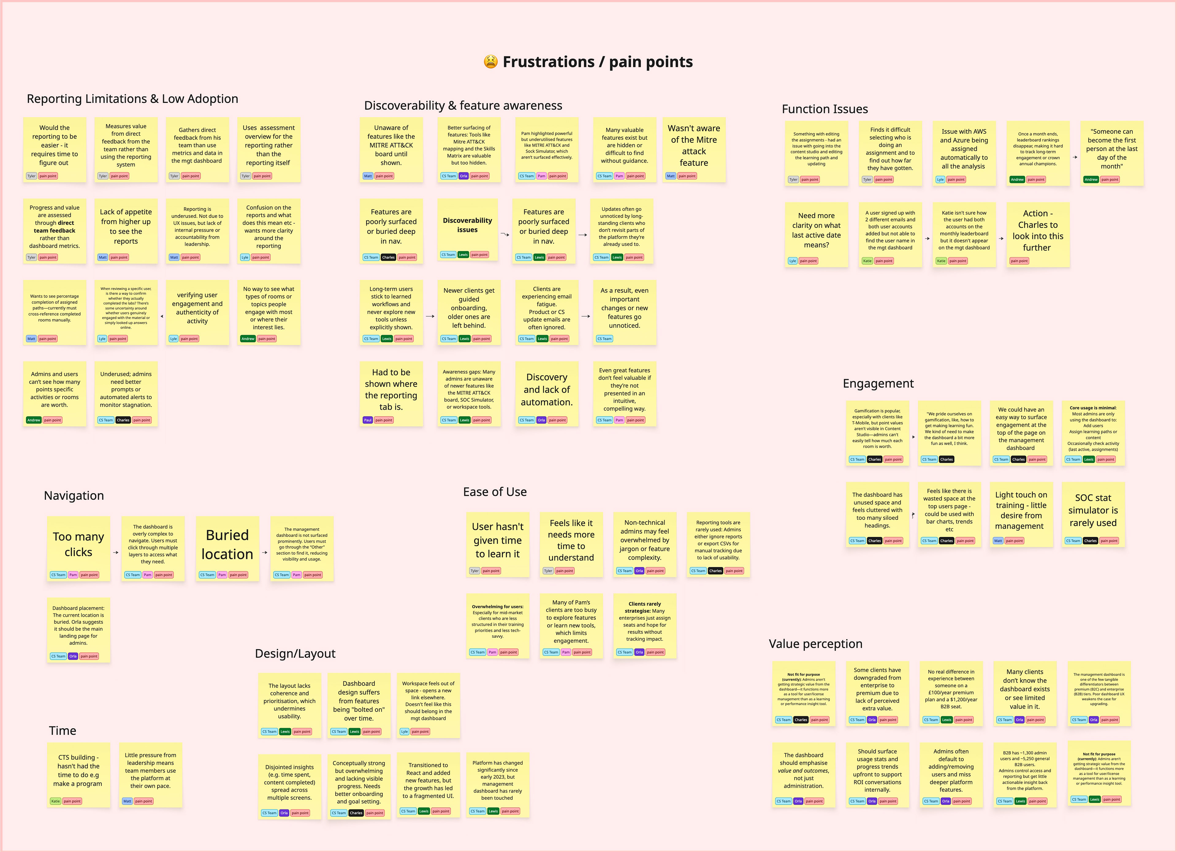
Interview insights
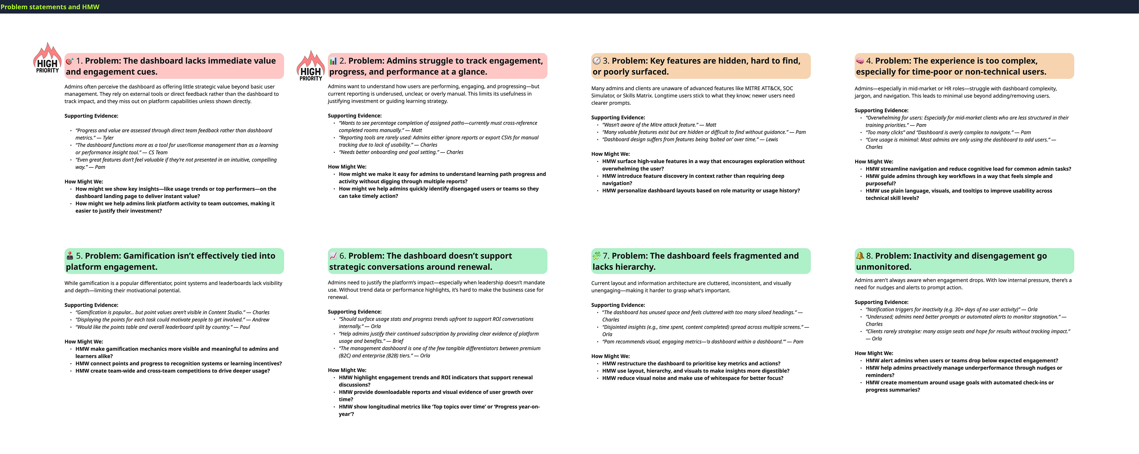
Problem Statements and HMW
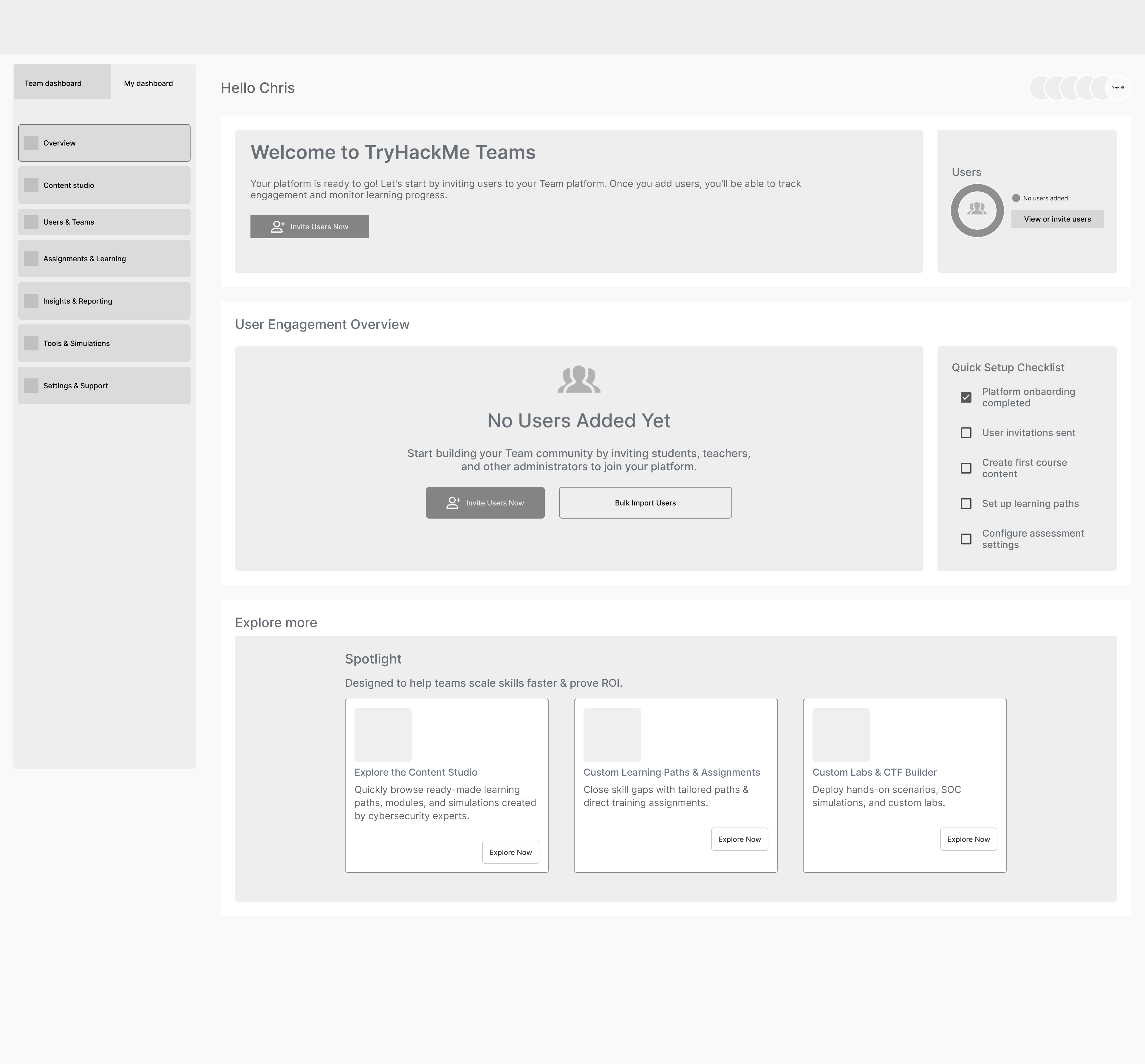
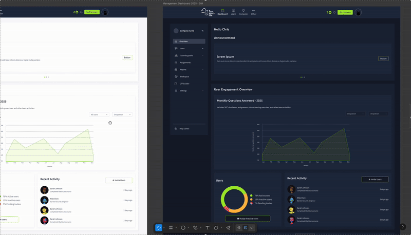
Low Fi wireframes
Following the discovery phase, I synthesised the key frustrations, pain points, and opportunities into clear problem statements and “How might we” questions. I shared these with the co-founder, head of product, and other stakeholders to align on a strategic approach. Together, we identified the admin dashboard landing page as the primary focus, given its role in driving traffic and shaping first impressions of value. From there, I began creating low-fidelity designs, which we iterated on through ongoing feedback.
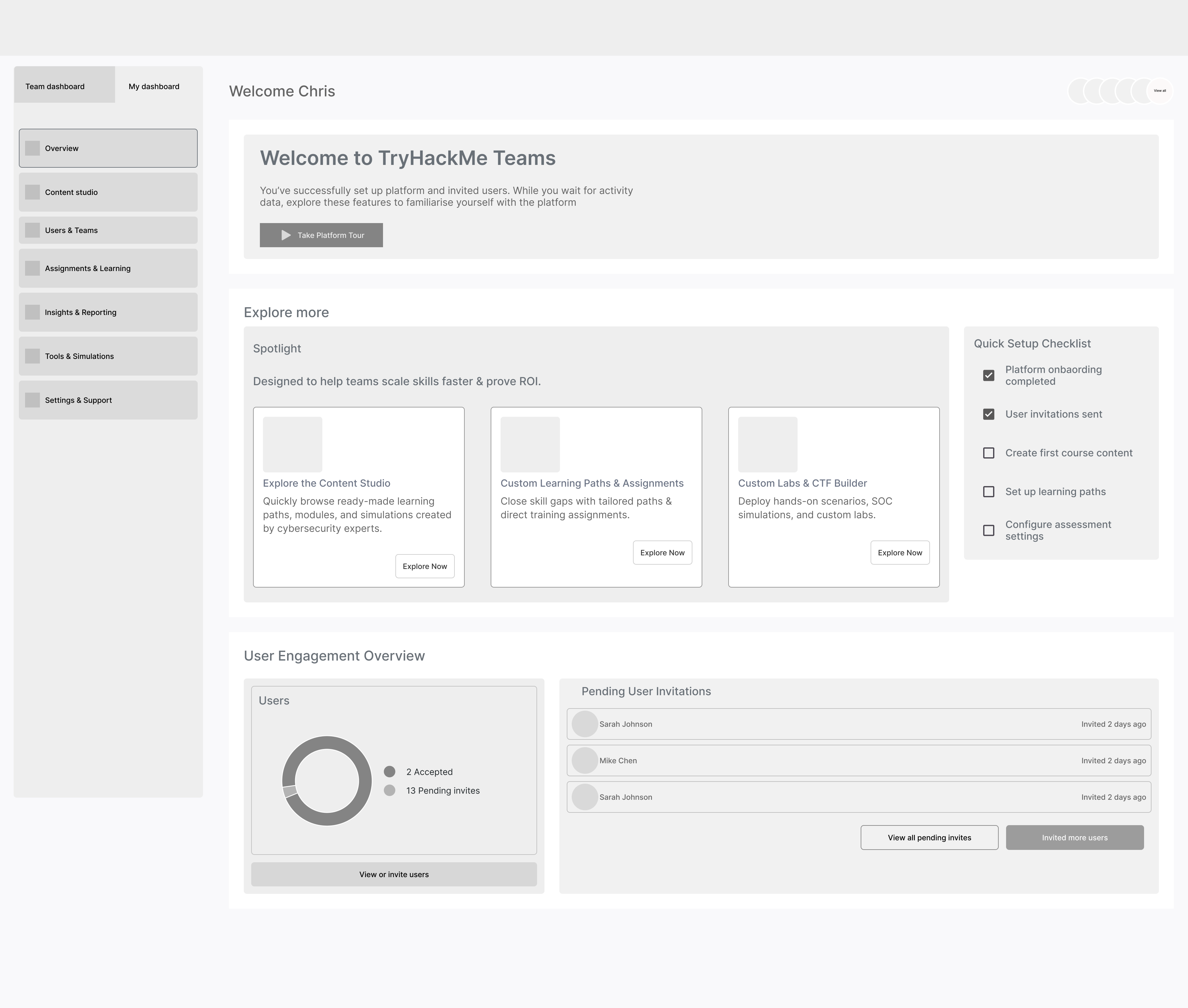
Feedback and iterations
After the first round of lo-fi wireframe iterations for the management dashboard, we shared them with the co-founder, the head of product, and product managers for feedback. One of the main challenges raised was around the value proposition: what exactly should the dashboard communicate, and what key metrics would give users meaningful insight at a glance? This became a recurring point of discussion that we had to revisit several times.
To guide our decisions, I drew on interview insights from the discovery phase. However, because many users rarely engage with the dashboard, it was difficult to gather truly actionable or high-value input. On top of that, the short timeframe meant we couldn’t run exercises like card sorting or task-based validation that would have helped us better understand which features and information users actually prioritise.
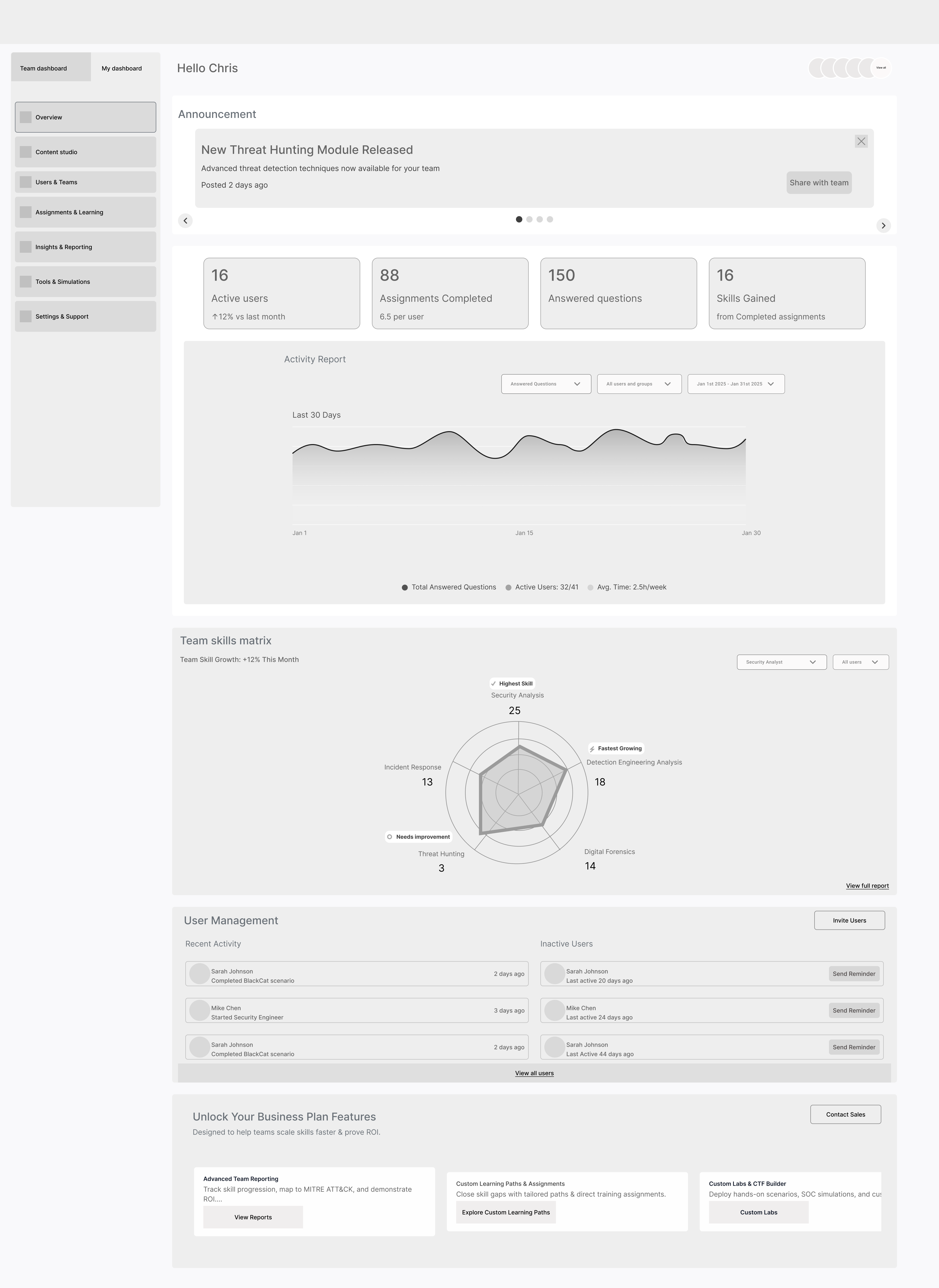
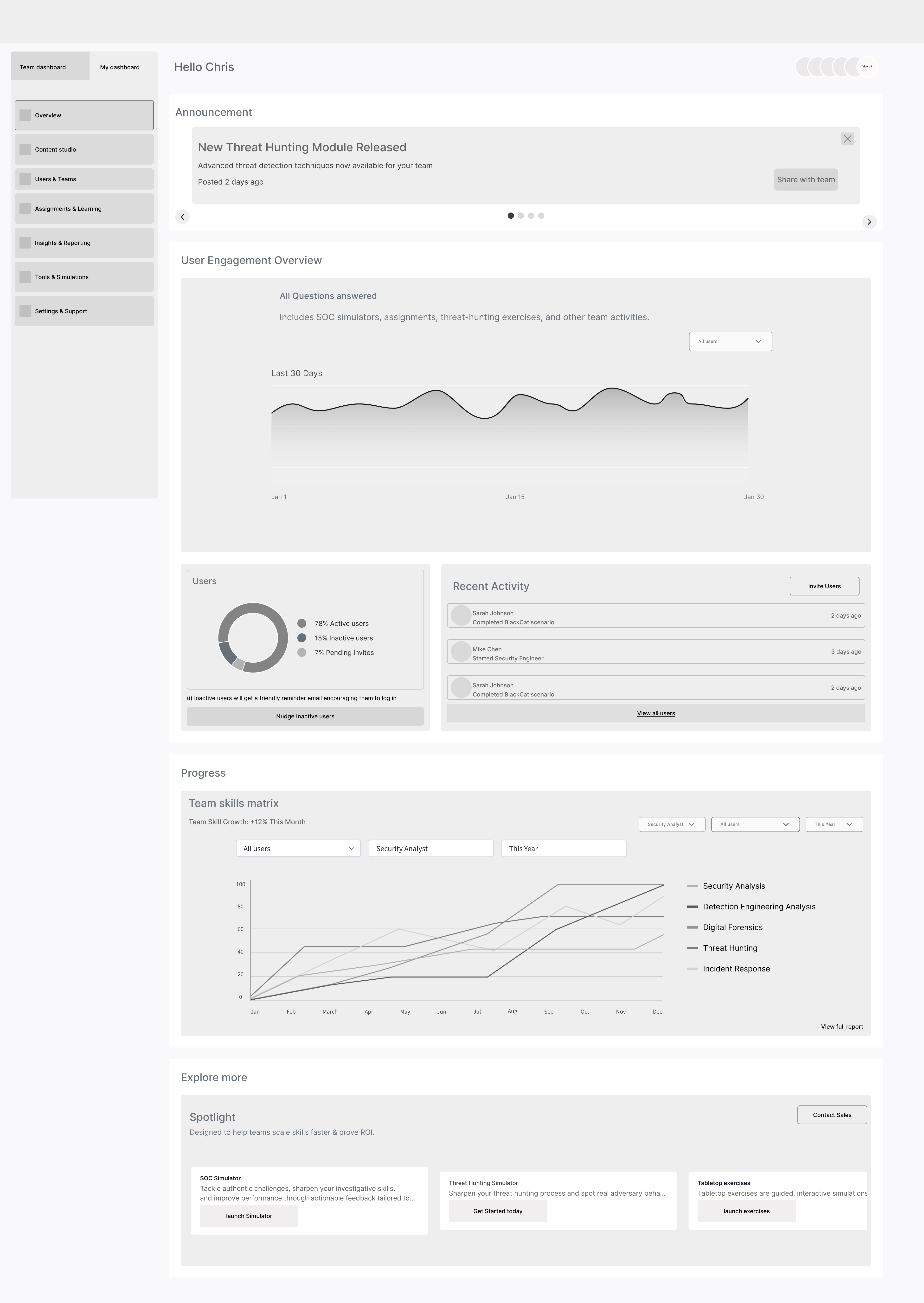
High Fidelity
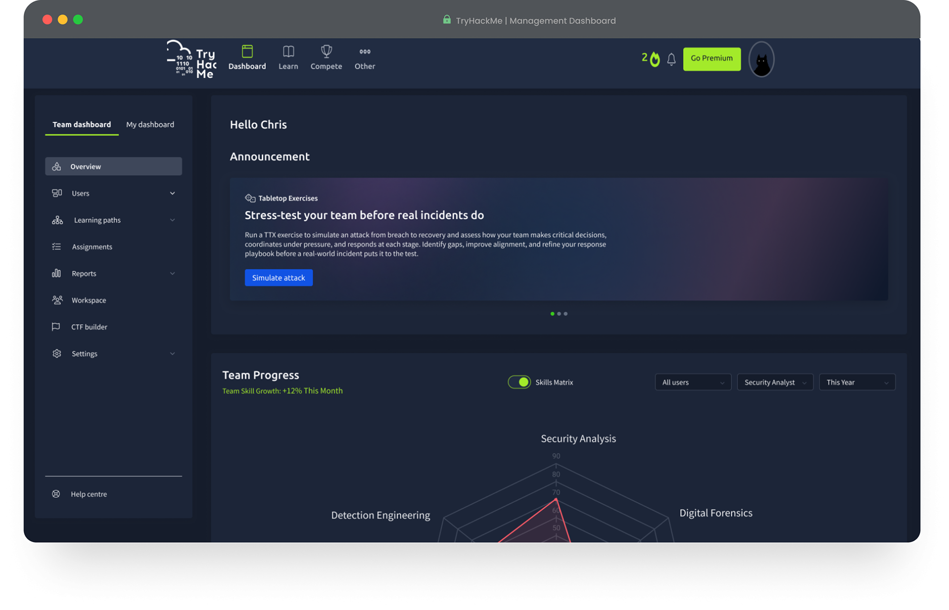
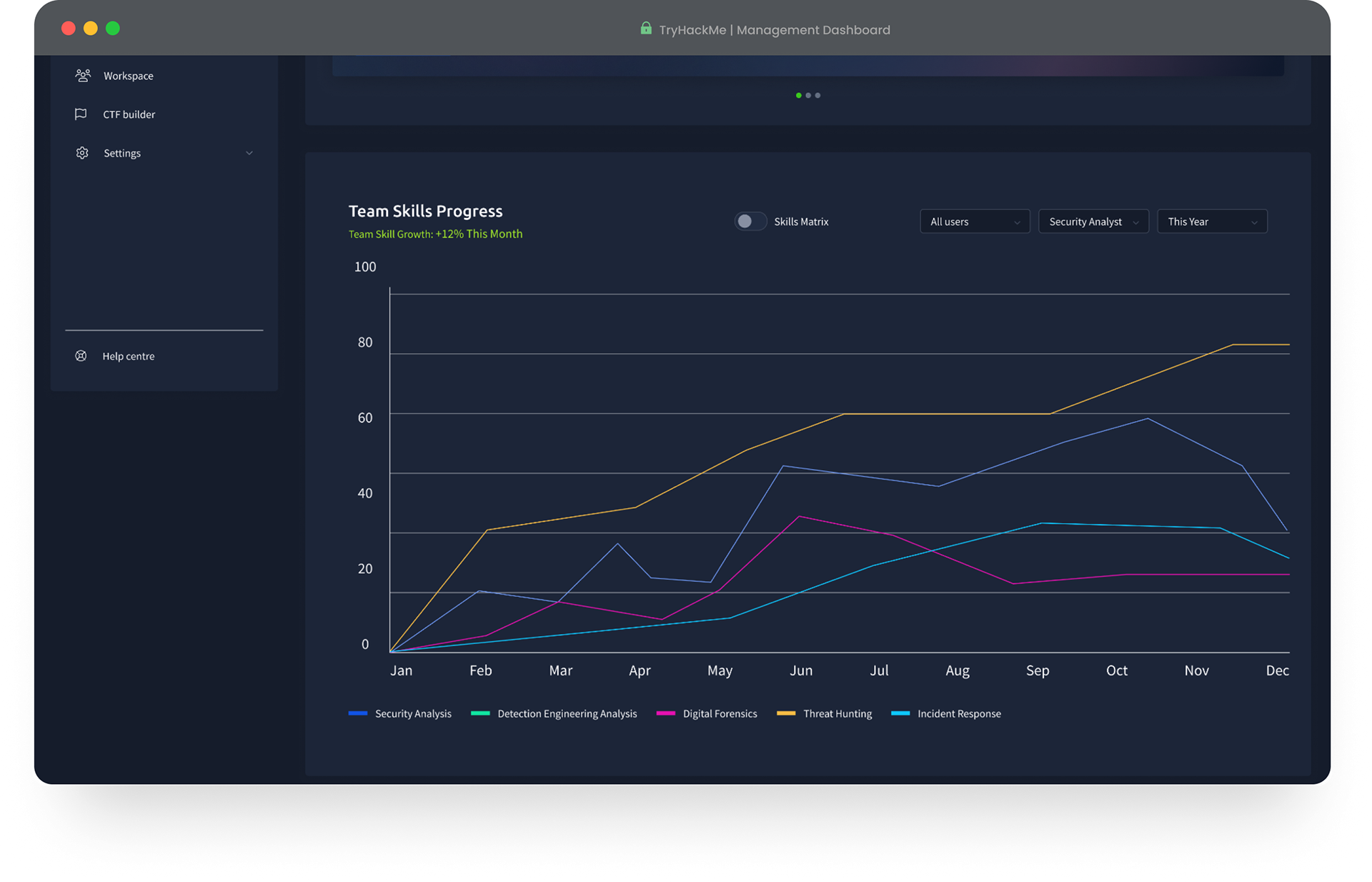
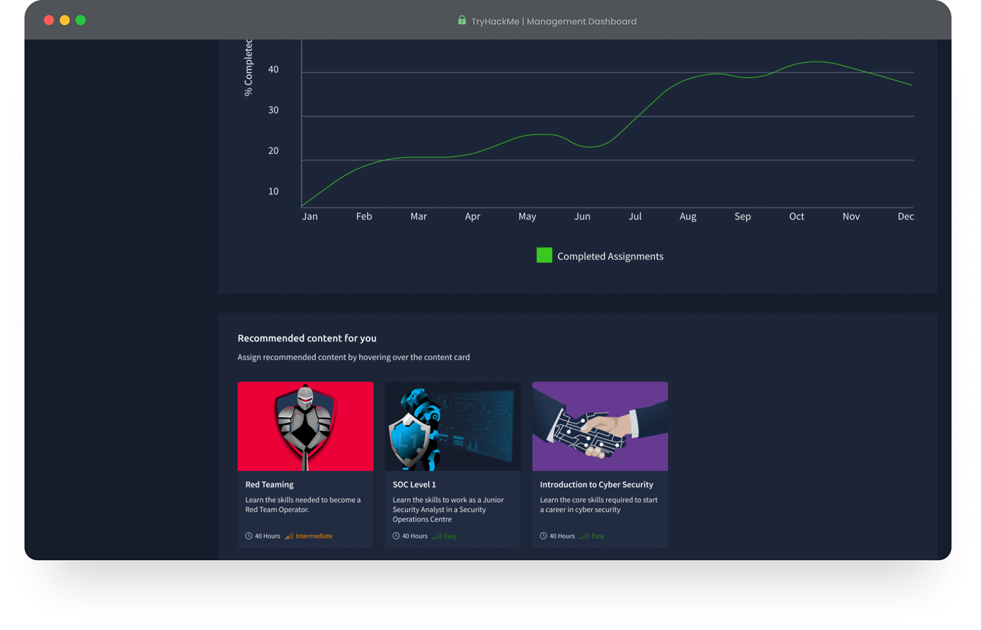
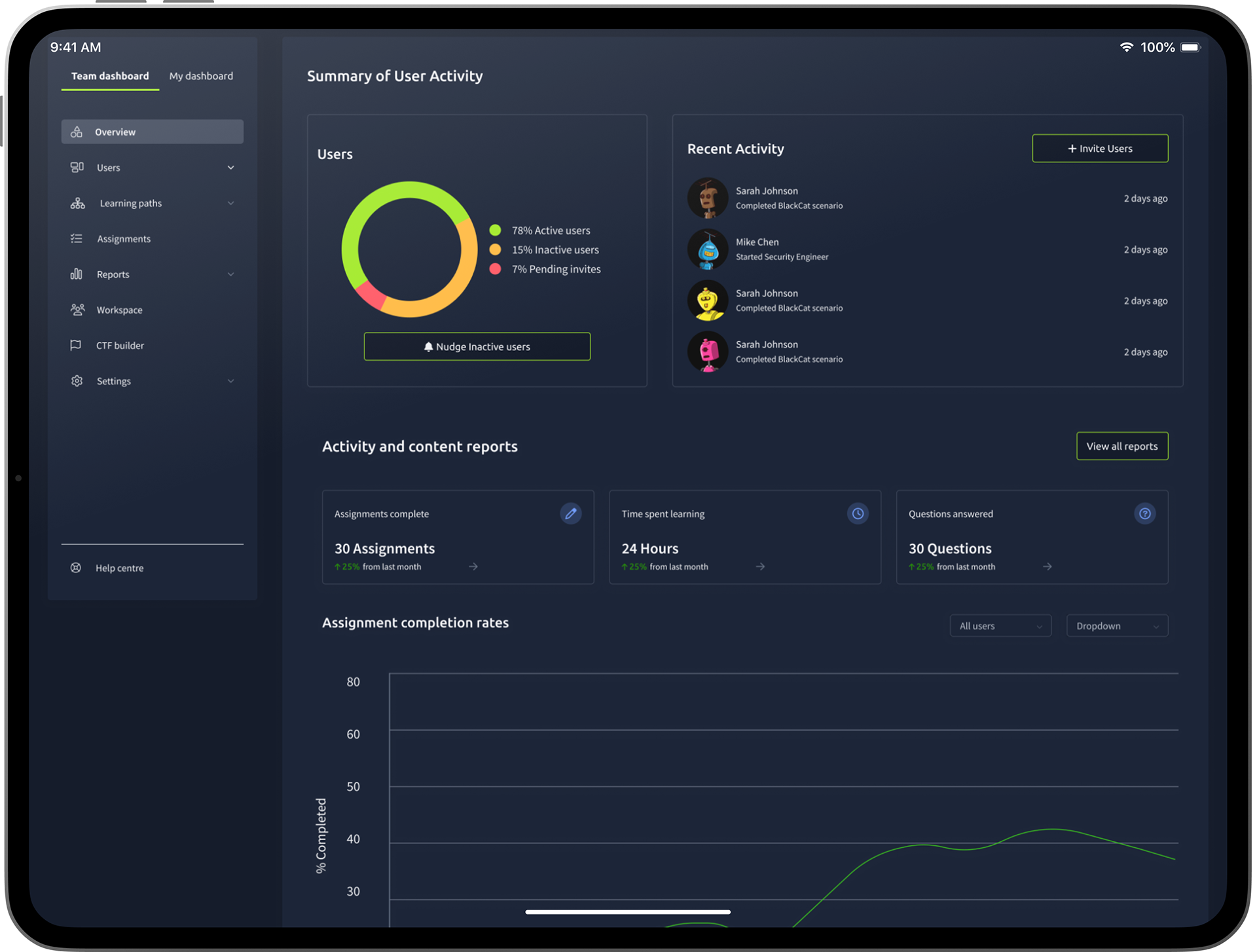
Final Dashboard
Conclusion
After five weeks of discovery and design work, the project was handed over to another designer to continue as my short-term contract came to an end. During this phase, the team successfully clarified the value proposition and defined key goals for the dashboard, informed by insights from user interviews, stakeholder workshops, and usability testing.
The foundational research and problem statements developed during my time on the project directly shaped the final implementation, ensuring that the redesign addressed core user pain points and aligned with business objectives. The resulting dashboard—now live—reflects many of the recommendations and design directions established through the discovery process.