
The Team
Christian Mtima: Senior UX/UI Designer
Bex: Product Manager
Gerogia: Product Lead
Johnny: Software engineer
Challenge
Customers were already comparing Beauty Pie products to premium brands as part of their purchase journey, but this behaviour was happening off-site. Research showed strong demand for comparison-led content, particularly among younger audiences, and over half of interviewed users referenced comparison as influencing their decisions. However, the website did not meaningfully support this behaviour, creating friction and reducing confidence at the point of purchase. The work needed to be designed and delivered within a tight two-week sprint.
Solution
I designed a structured comparison framework embedded across PLP, PDP, and dedicated comparison views. This included clear side-by-side tables highlighting price, performance, key ingredients, and service benefits, alongside simplified ingredient summaries to make complex formulations easy to understand. The experience was built around transparency, consistency, and scannability, supported by relevant social proof and review signals to reinforce credibility without overwhelming users.
Results
The comparison framework increased engagement with product pages, reduced reliance on external research, and improved customer confidence during decision-making. By reframing comparison as a transparent value narrative, the work strengthened trust in the brand and established a scalable model for future product categories
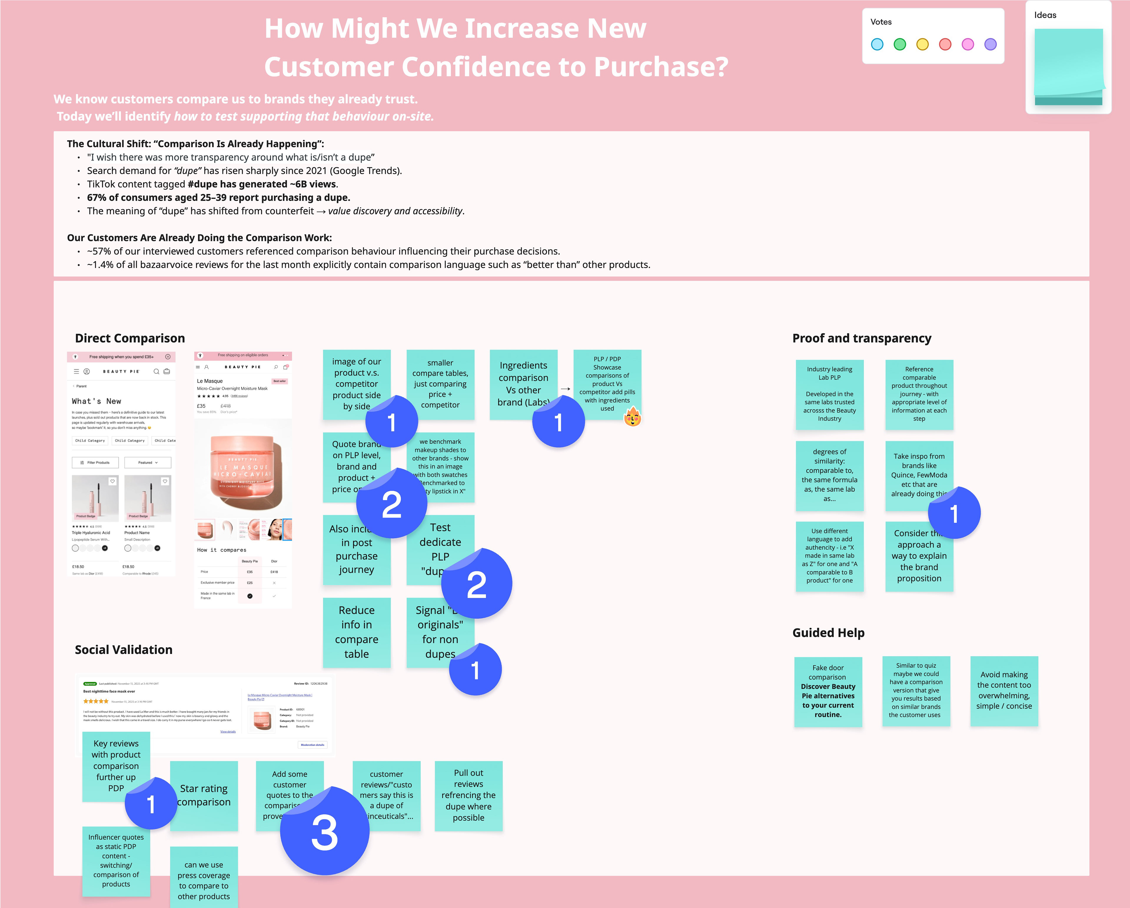
Ideation workshop
We ran a cross-functional ideation session with stakeholders, product managers, engineers, and marketing to align on opportunities and constraints early in the process. The group explored key dependencies and feasibility considerations that would shape the redesign. This work surfaced priority areas for focus, including integrating social proof, testing dedicated comparison PDP experiences, and developing clearer ingredient and formulation comparisons supported by lab and sourcing data. This shared input helped ensure the direction balanced user needs, technical feasibility, and commercial goals.
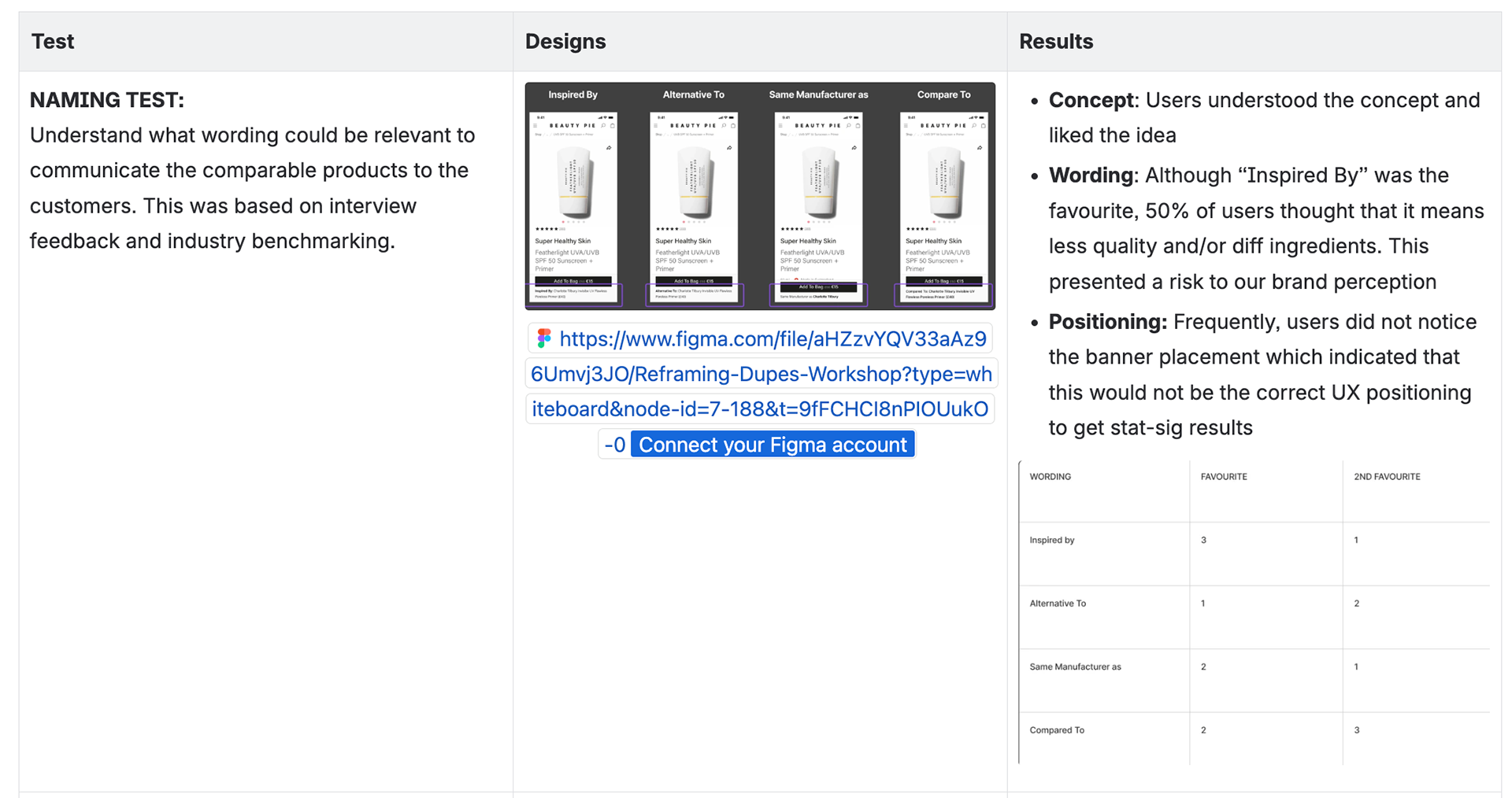
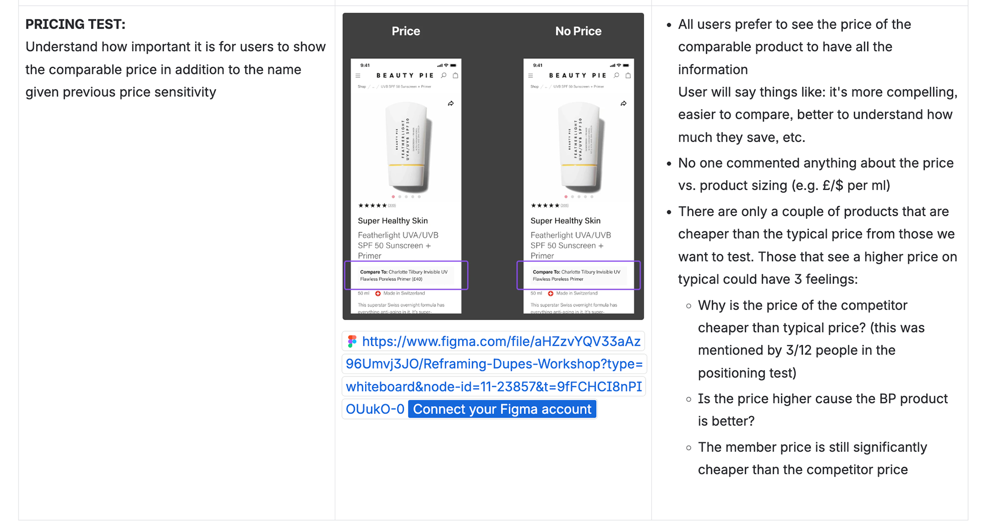
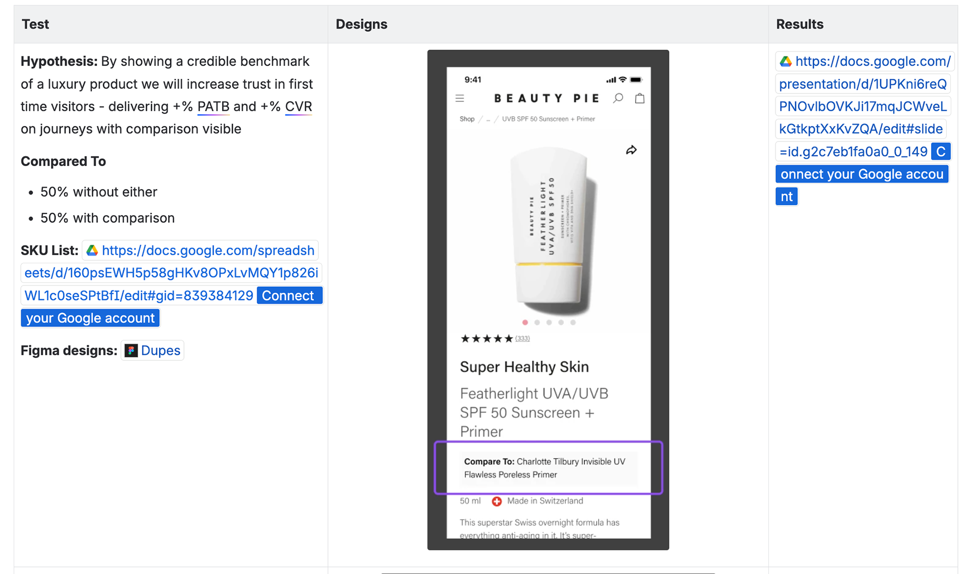
Research findings
We previously conducted user testing on naming, conventions, and the positioning of comparison features on PDPs, with consistently positive results. This validated customer interest and confidence in the approach, providing a strong foundation to explore and scale comparison-led experiences further.
Current journey
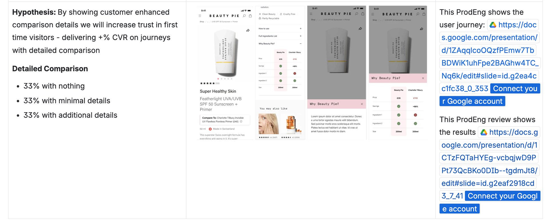
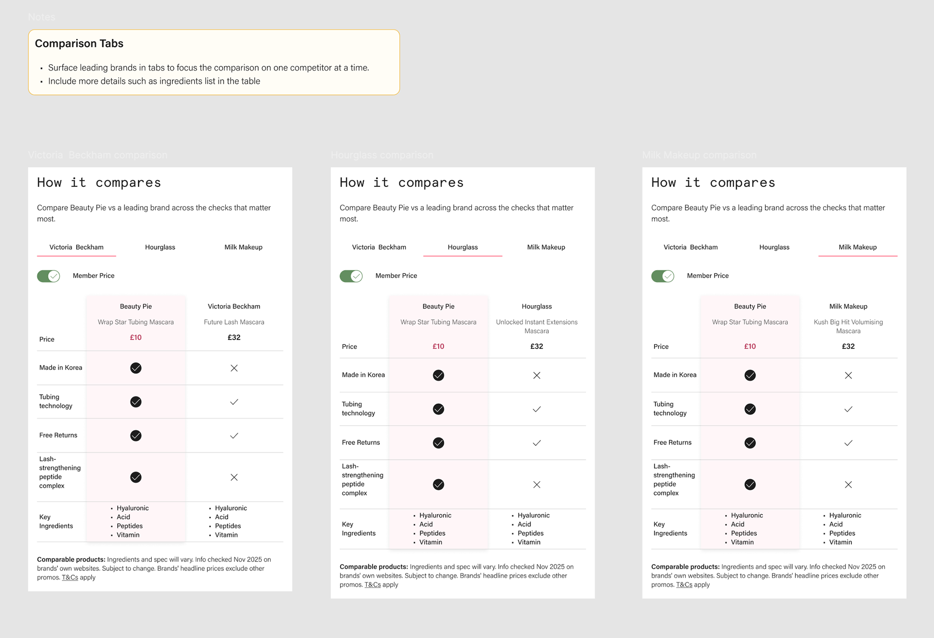
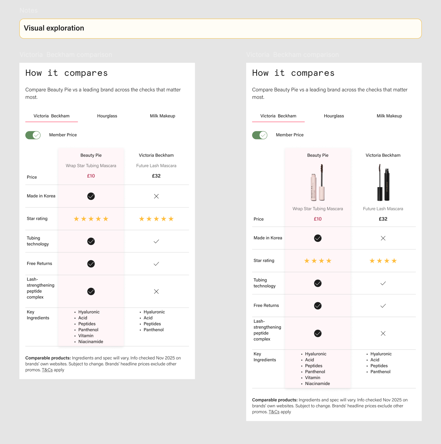
In the existing journey, the comparison table was presented as a static layout with three competitor products displayed side by side. While it contained all the relevant information, the lack of interaction and density of content created cognitive overload for users. To address this, I explored alternative approaches, including a tab-based layout and simplified two-product comparisons, to reduce complexity and make the information easier to scan and understand.
Concepts
As part of the concept exploration, I focused on making comparisons more visible and clearly positioning Beauty Pie alongside well known competitors. This included testing new entry points from the ideation session, such as PLP banners that guide users to a dedicated comparison experience. Within this PLP, users could interactively explore and compare products in context. The concept also introduced membership price toggles, competitor tabs for focused side by side comparisons, and simplified ingredient summaries. These ideas were designed to improve discoverability, encourage engagement, and test their impact on revenue and confidence in purchase decisions.
Final Designs
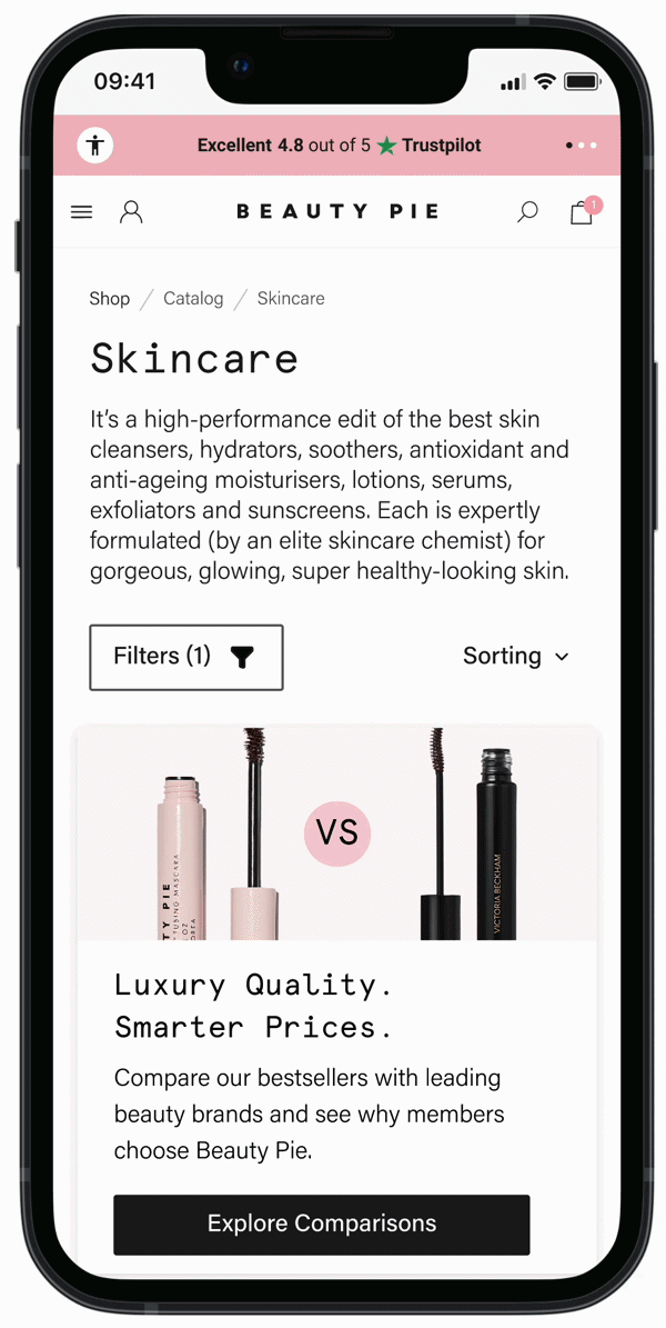
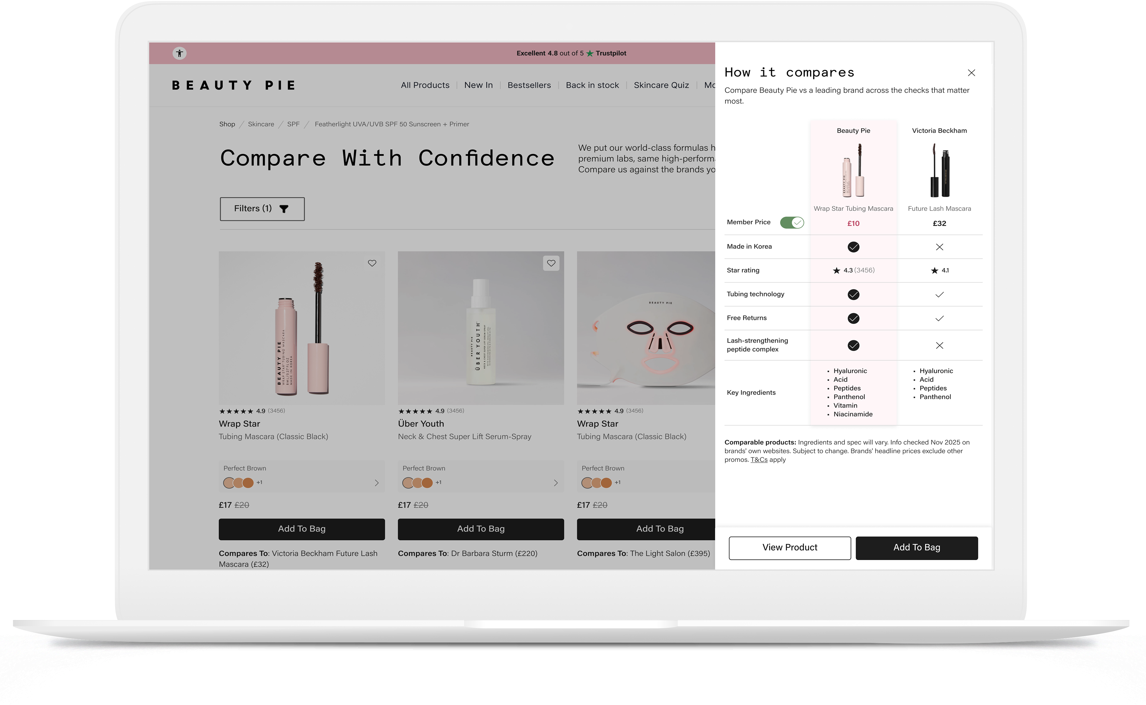
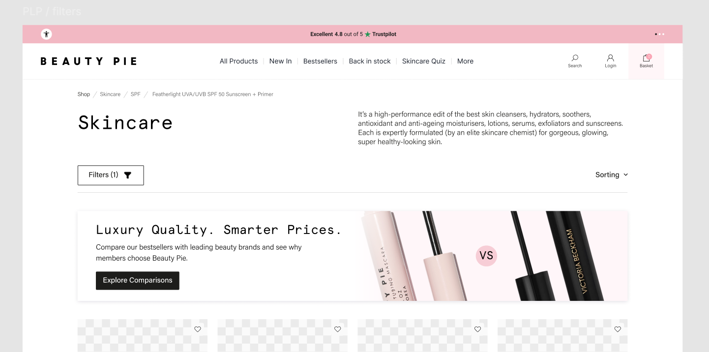
Dedicated Compare PLP
•Users are guided from a standard PLP via a banner to a dedicated comparison-focused PLP.
•This page surfaces products with direct competitors, such as Beauty Pie vs Victoria Beckham Future Lash.
•Selecting a product opens an interactive comparison flyout with detailed insights.
•The table is streamlined to show one competitor at a time, reducing cognitive load.
•If the initial variant performs well, additional competitors can be introduced through tabs.
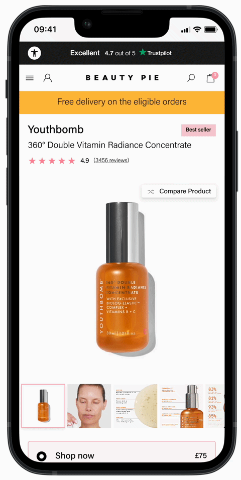
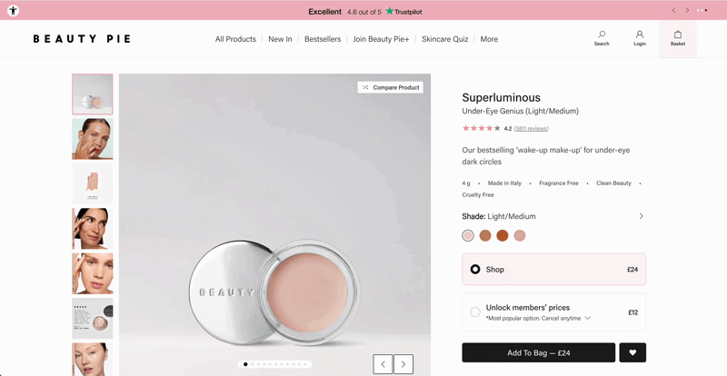
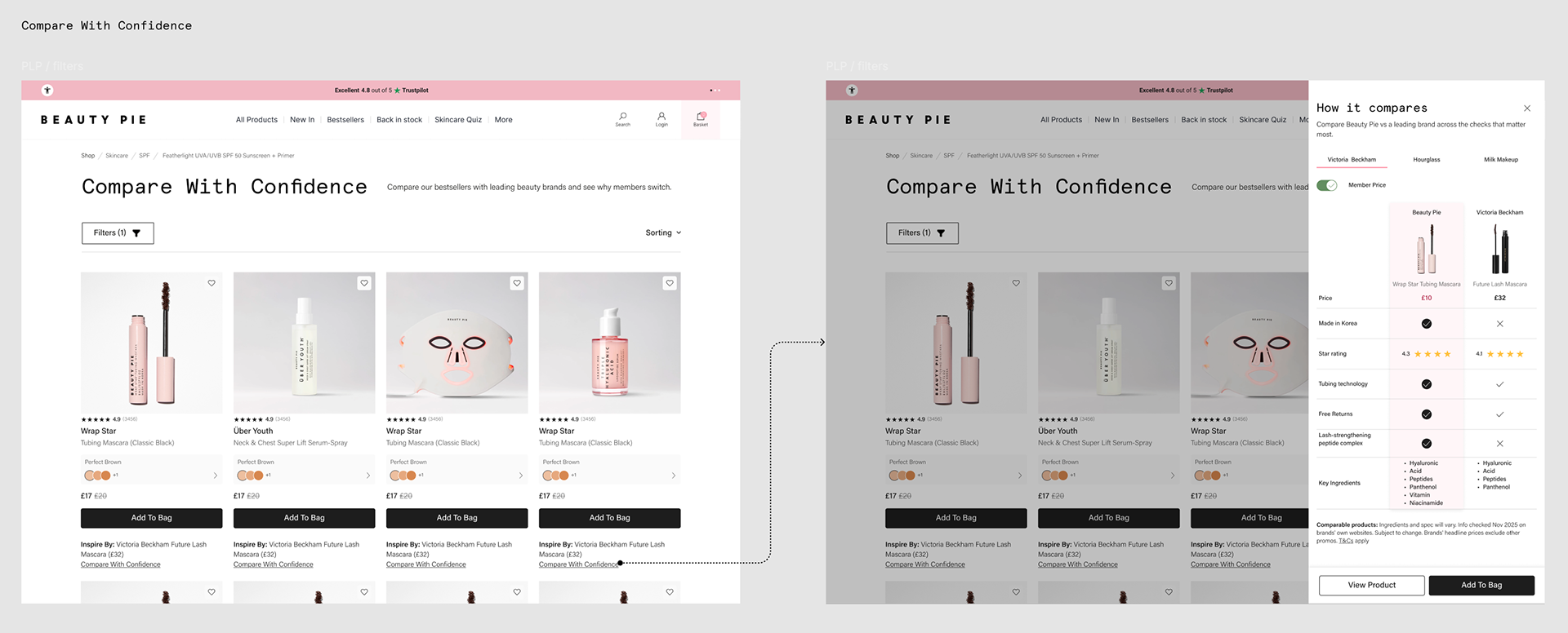
PDP Compare Product Flyout
•Users can access comparisons directly from the PDP via a dedicated “Compare products” CTA.
•Selecting the CTA opens a comparison flyout, replacing the current embedded in-page experience.
•This separates comparison content from core product information, reducing PDP cognitive load.
•The flyout enables clearer tracking of user engagement with comparison features.
•This approach supports experimentation and optimisation based on user behaviour.
PDP Anchor to compare table
•The PDP continues to use an anchor CTA that scrolls users directly to a streamlined comparison table.
•The table is simplified and refined to reduce complexity while retaining key decision-making information.
•This approach minimises development effort while still enabling tracking of engagement with both the CTA and the comparison section.